Responsibilities //
Design System Architecture
Token & Foundation Setup
Documentation & Guidelines
Component Library Creation
Team //
1x Design System Manager
3x Designers
Engineering Team
Year //
2023
Process
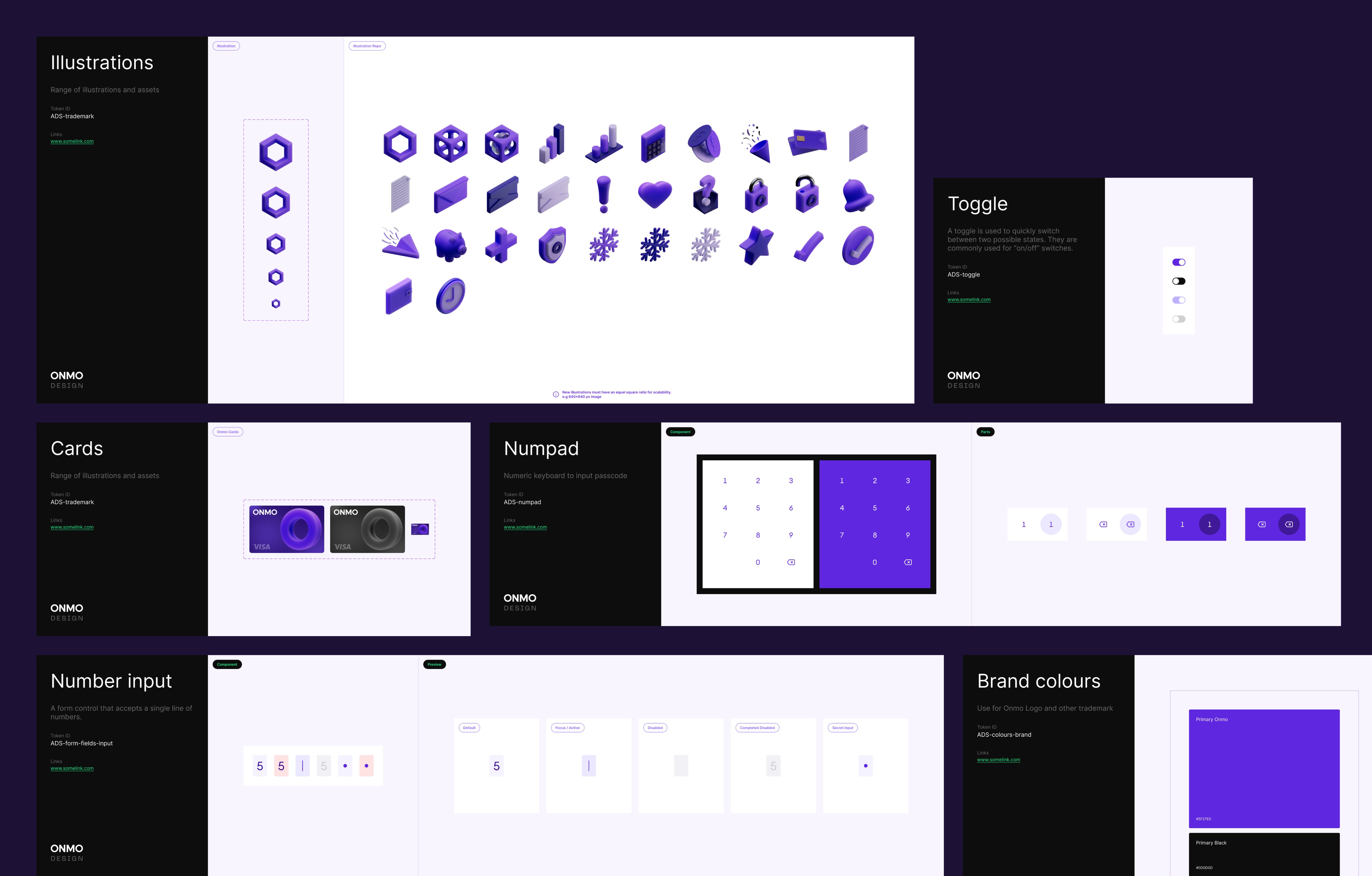
I built the component library in Figma, defined tokens, established spacing and typography rules, and documented usage guidelines.
To ensure adoption, I onboarded the design team through walkthroughs and created clear contribution processes. I also collaborated with engineers to align the system with front-end realities.


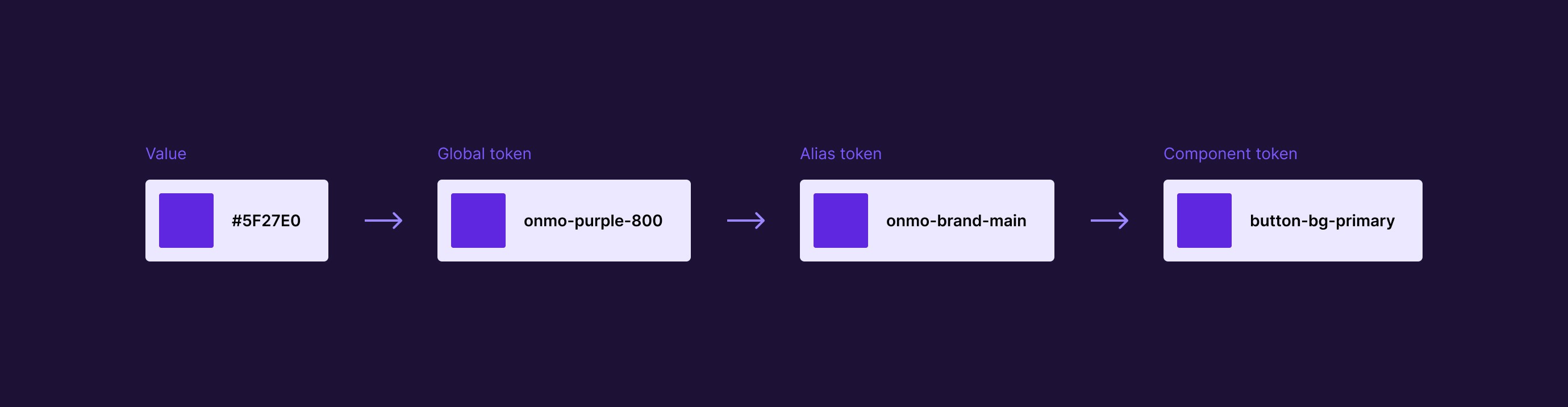
The token hierarchy establishes a clear separation between raw values, global design decisions, brand semantics, and component-level use.
Starting from the base value (#5F27E0), it is first abstracted as a global token (onmo-purple-800) for palette consistency, then mapped to a semantic alias (onmo-brand-main) for brand clarity, and finally applied as a component token (button-bg-primary) to drive UI elements.
Outcome
The ONMO Design System established a consistent, scalable foundation for product design. It improved collaboration between design and engineering, reduced UI inconsistencies, and accelerated delivery.
With clear documentation and reusable components, the system continues to support the team in building a cohesive and efficient user experience.